Case Study: Product Theming for Infor Rhythm
Background:
Infor Rhythm is an enterprise SaaS product built for e-commerce and the public sector. It offers an end-to-end solution with the integration of content management, product catalogs, product promotions, analytics, as well as customized website designs into one seamless offering.
“Part of my contribution on Rhythm was dedicated to the continuous upkeep and development of the Rhythm foundation UI kit and style guide, a baseline for how component looked and behaved.”
Part of my contribution on Rhythm was dedicated to the continuous upkeep and development of the Rhythm foundation UI kit and style guide, a baseline for how component looked and behaved, as Rhythm scaled to serve both the e-commerce and the public sector verticals to make sure there is a consistent product identity under one roof.
In order to make global UI changes for product theming, I needed to understand the technical capabilities and limitations through collaboration with the development team. How exactly were the UI components built? What was easy to change when we create a theme and what was not? Were the components even using the same primary and secondary colors? Were the components built with shared css variables?
“...more and more use cases were coming up and needing guidance on how to get “foundation” to absorb those use cases or how to extend or modify current components to use on two different verticals...”
As we were scaling out what "foundation" means for Rhythm while we learned its responsibilities and contribution towards both e-commerce and the public sector verticals, more and more use cases were coming up and needing guidance on how to get "foundation" to absorb those use cases or how to extend or modify current components to use on two different verticals. How can the “foundation” features be distributed to the verticals?
The goal for this project was to identify a systematical way to scale the UI for future product theming.
Rhythm UI Kit
Process – Research:
Through collaboration with product management, we had identified that there would be product feature requests just for foundation besides feature requests for the e-commerce and the public sector verticals. That meant Rhythm foundation work was on its own release train based on submissions from the verticals. The foundation team was responsible to build and test out features and components before they could be used in the e-commerce and the public sector products.
“With UI theming being one of the most crucial parts of the Rhythm offering, I needed to better understand how components were created from a development perspective.”
With UI theming being one of the most crucial parts of the Rhythm offering, I needed to better understand how components were created from a development perspective. I started working with our engineers by looking through our components to identify the variables and variable definitions. A variable of a component could be the background color or size or radius, and a variable definition could be yellow or 30px or 4px.
Think of the input fields which include variables of border, placeholder text, labels, border radius, background color, font size, text decoration, and drop shadow. The border radius of the input field variable had a value of 2px, and that could be shared between many other components, like buttons, checkboxes, dropdowns. In order to create themes efficiently using CSS variables, we needed not to think of components as stand-alone objects but as a system.
“In order to create themes efficiently using CSS variables, we needed not to think of components as stand-alone objects but as a system. ”

UI theming discovery through component variations audit
Left: List of UI components with their styling variations
Right: UI component definitions
Bottom: List of styling variables mapped to UI components
Outcome:
Simply put, to create a new theme, we needed to know all the global variables and variable definitions (like the 2px border radius) in order to create a theme that is styled consistently and systematically across all components. The more variables and variable definitions we could identify, the better we could streamline our designs and the better we could scale and build out themes in the future.
“...we needed to know all the global variables and variable definitions... in order to create a theme that is styled consistently and systematically across all components.”
With the effort of doing an UI audit across our components, I now could see exactly what the styling variations are for each one, and I could see what the variable definitions are as well as where those are applied. The audit gave us a lens into how theming can be done by simply grouping or doing key pairing of the component variable and the definition. We then had a solid ground to stand on to make global UI changes effectively.
Below are some UI theming concepts to demonstrate and inspire future state of Rhythm’s visual theming capabilities.
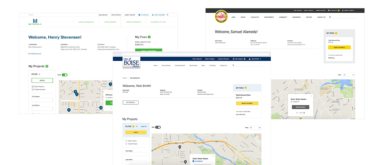
UI theming concepts for the public sector vertical